
Blog formatting controls how much of your content gets read. A Nielsen Norman Group eyetracking study with 232 participants found that users scan web pages in an F-shaped pattern, focusing on headlines and the first few words of each line before skipping the rest (Source). Nielsen’s separate analysis of browsing behavior confirmed that users read only 20 to 28% of the words on a typical webpage (Source).
This guide covers the blog formatting rules for heading hierarchy, paragraph structure, scannability, layout, and the mistakes to avoid.
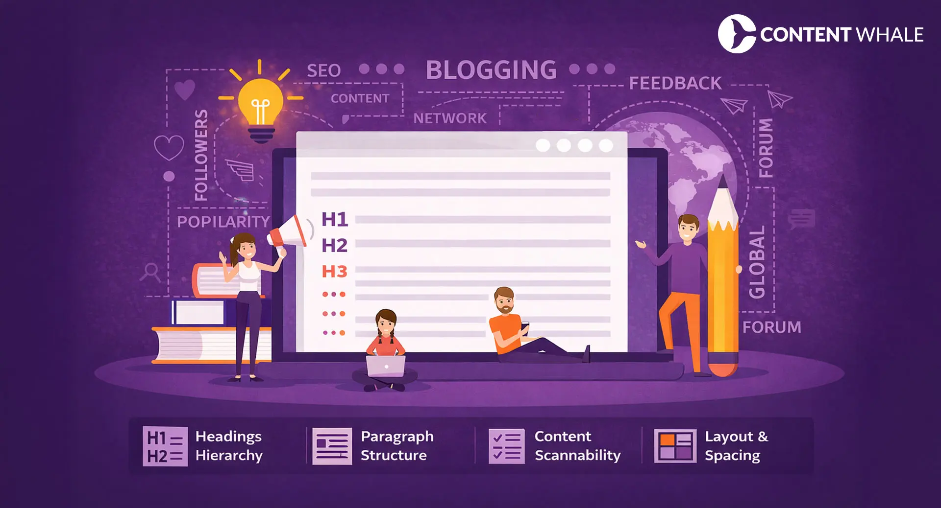
What Is Blog Formatting?
Blog formatting refers to how written content is visually organized on a page. It covers headings, subheadings, paragraph breaks, sentence length, bullet points, bold text, and image placement.
A strong blog writing format does two things. First, it creates a visual hierarchy that guides the eye from section to section. Second, it breaks information into smaller units, which makes processing easier for readers who scan rather than read linearly.
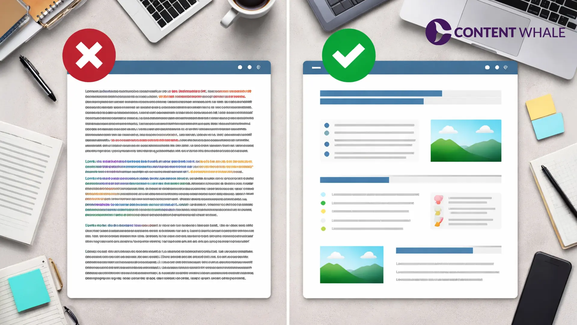
Poor blog formatting produces walls of text that work against how people read online. The Baymard Institute’s usability research found that users experience fatigue when reading lines exceeding 80 characters, and overly dense layouts contribute to higher exit rates (Source). Every blog post format decision shapes the reader’s experience for better or worse.
The core elements of effective blog formatting include:
- Heading hierarchy (H1 through H4) for logical section breaks
- Short paragraphs that carry one idea each
- Bullet and numbered lists for multi-point information
- Bold text for key terms and conclusions
- White space between sections for visual breathing room
- Consistent typography and font sizing

The Four Pillars of Effective Blog Formatting
High-performing content tends to follow four structural principles. These are widely adopted conventions in content publishing that correlate with stronger readability metrics.
1. Clear Heading Hierarchy
Headings serve as navigation markers for both readers and search engine crawlers. A logical heading hierarchy starts with one H1 (the title), breaks into H2 sections for major topics, and uses H3 and H4 tags for supporting details. This is a foundational element of any blog writing format.
This blog formatting practice matters because of the layer-cake scanning pattern identified by Nielsen Norman Group. In this pattern, readers fixate only on headings and subheadings, skipping body text until they find a section that matches their interest (Source). Vague or inconsistent headings give readers no reason to stay.
Widely used blog post format for heading structure:
- H1: Blog title (one per page)
- H2: Main topic sections
- H3: Subtopics within each H2
- H4: Supporting details or examples under H3
Keep headings descriptive and keyword-aligned. A heading like “Paragraph Structure” is weaker than “How Paragraph Length Affects Blog Readability.” Descriptive headings improve both scannability and content indexing. Google’s documentation confirms that headings help structure content for users and accessibility, making it easier for search engines to understand page organization (Source).
2. Readable Paragraph Structure
Long paragraphs are a common reason readers disengage from blog posts. According to Databox data from September 2024, the median bounce rate across all industries sits at 44.04% (Source). Multiple factors contribute to high bounce rates, and dense text blocks are one of them.
A widely adopted practice in blog formatting is keeping paragraphs to 2 to 4 sentences. This is an industry convention rather than a scientifically tested rule, but it aligns with how users scan content online. Each paragraph carries one idea, which makes scanning faster.
Short paragraphs create natural pauses that let readers absorb one concept before moving forward. This blog writing format also performs better on mobile devices, where a single long paragraph can fill an entire screen and discourage scrolling.
A common industry practice for blog formatting is keeping paragraphs to 2 to 4 sentences. Each paragraph carries one idea. Shorter paragraphs improve mobile readability and tend to correlate with lower bounce rates.
3. Content Scannability
Readers do not consume blog content word by word. They scan for key insights, relevant data, and actionable information. Blog formatting should support this behavior.
Techniques that improve content scannability in your blog post format:
- Bullet lists for steps, tips, or grouped items
- Numbered lists for sequential processes
- Bold text on key phrases and conclusions
- Short sections under each subheading
- Descriptive headings that preview section content
Formatting for scannability structures information so readers can find what they need in seconds. A well-formatted blog post lets a 30-second scanner and a 5-minute deep reader both extract value from the same piece. That is the mark of an effective blog writing format.
4. Consistent Layout Structure
Layout consistency makes a blog predictable and easier to read. When readers know where to expect headings, images, and key takeaways, they move through content faster.
A common blog writing format layout used in high-performing content includes:
- Headline (H1)
- Introduction with the main answer upfront
- Table of contents (optional for long-form posts)
- Main sections with H2/H3 hierarchy
- Supporting visuals after headings or key points
- Conclusion with CTA
This is not a universal standard but a widely adopted structure across content publishing. Maintaining this layout across posts builds reader trust and signals that your content follows a professional blog post format.
Sentence Spacing and Line Length in Blog Formatting
Line length has a measurable impact on reading comfort. Typographer Emil Ruder’s research, published in “Typographie,” established that the optimal line length for body text is 50 to 60 characters per line. The Baymard Institute extended this range to 75 characters for digital content (Source).
The WCAG accessibility guideline 1.4.8 (Level AAA) recommends that lines of text contain 80 or fewer characters to support readability for users with visual or cognitive disabilities (Source).
Lines that are too long force readers to track text across the screen, which increases eye fatigue. Lines that are too short break reading rhythm by forcing excessive line jumps. Any effective blog writing format accounts for these constraints.
Blog formatting rules for sentence spacing:
- Target 50 to 75 characters per line on desktop
- Use short, direct sentences
- Break complex sentences into two shorter ones
- Add adequate line height (1.5x font size minimum) for visual spacing
The optimal line length for blog content is 50 to 75 characters per line, based on typography research cited by the Baymard Institute. WCAG 1.4.8 (Level AAA) recommends no more than 80 characters for accessibility.

Using Lists and Bullet Points in Your Blog Post Format
Lists are one of the most effective blog formatting tools for presenting grouped information clearly. When a paragraph tries to present five or more items inline, readers lose track. A bulleted or numbered list makes each item distinct and scannable.
Use bullet lists when presenting:
- Tips or best practices
- Features or benefits
- Comparisons or contrasts
- Components of a process
Use numbered lists when sequence matters, such as step-by-step instructions or ranked items.
One common mistake in blog writing format is overusing lists. If every section is a list, the blog loses narrative flow. Lists work best when they break up dense content. The surrounding paragraphs should provide context, analysis, or examples that lists cannot deliver on their own.
Highlighting Key Information
Visual emphasis helps readers locate the most important ideas in your blog formatting. Bold text, block quotes, and callout boxes all serve this purpose.
Best practices for highlighting in blog formatting:
- Bold only key terms, conclusions, or data points
- Avoid bolding entire sentences or paragraphs
- Use block quotes for expert opinions or cited statistics
- Limit highlights to 2 to 3 per section to maintain impact
Excessive highlighting defeats its own purpose. When everything is bold, nothing stands out. A clean blog post format uses emphasis sparingly to draw the eye to what matters most.
Visual Elements in Blog Formatting
Images, diagrams, charts, and infographics break up long text sections and give readers a cognitive pause. Content with visuals tends to show higher engagement metrics, though this is an observational pattern rather than a proven causal rule.
Rules for using visuals in your blog writing format:
- Place visuals directly after the heading or key point they support
- Use alt text for every image (for accessibility and SEO)
- Compress images to maintain fast page load speed
- Avoid decorative images that add no informational value
Visuals contribute to the overall visual hierarchy of a blog post format. Alternating between text, visuals, and white space helps maintain reader attention across longer word counts.
Place visual elements directly after headings or key content points. Compress all images for speed, use descriptive alt text, and avoid decorative visuals that do not support the content.
Common Blog Formatting Mistakes to Avoid
Even well-researched content underperforms when blog formatting rules are ignored. These are the most frequent formatting errors:
- Large text blocks with no paragraph breaks: Dense paragraphs of 6+ sentences push readers away, especially on mobile.
- Inconsistent heading structure: Jumping from H2 to H4 or using multiple H1 tags confuses both readers and search engines.
- Overuse of bold and italic text: When too much content is emphasized, the visual hierarchy collapses and nothing stands out.
- Missing white space: Without spacing between sections, the blog looks cramped and difficult to scan.
- Random image placement: Images dropped in the middle of paragraphs without connection to surrounding text disrupt reading flow.
Each of these blog formatting mistakes correlates with lower time on page and increased pogo-sticking, where users return to search results immediately after landing.
Blog Formatting Checklist
Before publishing any post, run through this blog formatting checklist:
- One H1 headline per page
- Logical heading hierarchy (H1 > H2 > H3 > H4)
- Short paragraphs carrying one idea each
- Bullet or numbered lists for grouped information
- Consistent formatting style across all sections
- White space between sections and after headings
- Bold text used only for key terms and data
- Images placed after relevant headings with alt text
- Line length between 50 and 75 characters
- Mobile preview completed before publishing
This checklist works as a final quality gate for your blog post format. Blog formatting problems are easier to fix before publishing than after traffic data reveals engagement drops.
Conclusion
Blog formatting shapes how readers interact with your content. The research is consistent: users scan in F-patterns, read under 30% of page text, and leave when they hit dense text blocks. Heading hierarchy, short paragraphs, proper line length, and strategic use of visuals all work together to keep readers engaged.
Formatting does not replace strong writing, but strong writing without proper formatting loses most of its audience before the second scroll.
Need SEO-optimized, well-formatted content that drives traffic and keeps readers on the page? Get in touch today with Content Whale and let our team handle the content while you focus on growth.
Frequently Asked Questions
What is blog formatting and why does it matter?
Blog formatting is the visual structure of content on a webpage, including headings, paragraphs, lists, and spacing. It matters because users scan in F-patterns and read under 30% of page text on average.
What is the recommended paragraph length for blog posts?
A widely adopted blog formatting practice is keeping paragraphs to 2 to 4 sentences. Each paragraph should carry one idea. This convention improves scannability on both desktop and mobile screens.
How does blog formatting relate to SEO?
Blog formatting improves user experience, which can indirectly support search performance. Better readability tends to increase time on page and reduce pogo-sticking, both of which reflect content quality to search engines.
What are the most common blog formatting mistakes?
The most common blog formatting mistakes include large unbroken text blocks, inconsistent heading hierarchy, overuse of bold text, missing white space, and random image placement. A proper blog writing format avoids all of these.


 Content Whale – USA