What is article writing? But first, you should know why it is so important. Globally, there are more than 600 million blogs, and platforms like WordPress see over 70 million new posts each month, highlighting the extensive reach and influence of article writing.
While the vast number of posts suggests a thriving field, engagement metrics tell a different story. Most readers spend only about 30-40 seconds per blog post, underlining the challenge of maintaining attention in a saturated content space. To address this, the article’s writing format and depth are pivotal. Longer posts, typically referred to as long-form writing, averaging around 1,427 words, have proven more effective. Incorporating original research into article writing examples boosts the likelihood of achieving desired outcomes by 41%, emphasizing the value of thorough, well-researched content.
For those looking to write an article and potentially get paid to write articles, understanding these dynamics is crucial. The format often follows a structured approach, where clear, engaging, and well-researched content is presented, making it possible for writers to not only share knowledge but also write articles for money. Learning what is format of article writing is and what is article writing with examples can significantly enhance a writer’s ability to produce compelling content that captivates and retains reader interest.
What is Article Writing?
Article writing is the process of creating structured, engaging content intended for publication in newspapers, magazines, and online platforms. Unlike essays or short stories, articles are factual, concise, and designed to reach a broad audience with varying interests.
Why is Article Writing Important in Marketing?
In marketing, journalism, and education, article writing serves as a cornerstone for communication. It drives SEO, fuels content marketing strategies, and spreads knowledge, making it essential for anyone looking to establish a presence or share information online.
Who Can Benefit from Learning Article Writing?

From aspiring bloggers and content creators to business owners and marketing professionals, mastering article writing can open numerous doors. It enhances one’s ability to communicate effectively, engage with audiences, and promote ideas or products through compelling narratives. Learning what is article writing offers a foundational skill for anyone in the digital content space. Additionally, understanding article writing format and exploring article writing examples can significantly improve one’s craft.
For those interested in making a career out of their skills, knowing how to write an article and familiarizing oneself with what is article writing with example are invaluable. There is also the opportunity to be paid to write articles. Whether you aim to write articles for money or to share your insights, the ability to articulate ideas clearly and engagingly is beneficial. Moreover, mastering what is long-form writing can help in creating more in-depth and valuable content that stands out in today’s competitive landscape.
What Will You Learn in this Guide About Article Writing?
This guide will teach you what is article writing by exploring different types of articles, from informative to persuasive. It will break down the components of a well-structured article, highlighting the article writing format and what is format of article writing.
You’ll learn about the writing process from brainstorming to publication, discover essential tools for writers, and explore opportunities for monetizing your writing skills. Whether you aim to write an article for professional gain or personal satisfaction, this guide offers comprehensive insights into how to write articles for money.
Additionally, you’ll find practical article writing examples and learn what is article writing with example, which can help you understand how to craft compelling content.
For those interested in more extensive content, the guide covers what is long-form writing, equipping you with the knowledge to engage readers with more in-depth analysis and detailed narratives.
If you are looking to be paid to write articles, this guide also delves into strategies for making a career out of article writing, showcasing how effective communication can turn into a profitable endeavour.
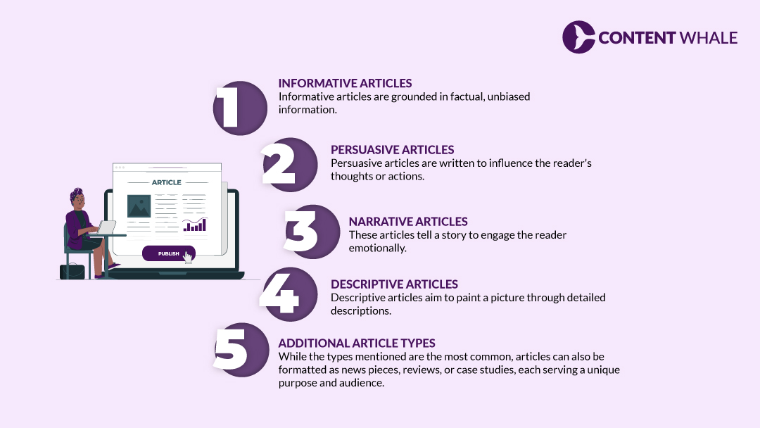
What are Different Types of Article Writing?

1. Informative Articles
Informative articles are grounded in factual, unbiased information. Their primary goal is to educate the reader about a particular topic, such as “A Beginner’s Guide to Gardening,” without swaying their opinion.
2. Persuasive Articles
Persuasive articles are written to influence the reader’s thoughts or actions. They present compelling arguments and evidence, urging the reader toward a specific viewpoint or action, like in “Why You Should Invest in Solar Power.”
3. Narrative Articles
These articles tell a story to engage the reader emotionally. They often follow a personal journey or explore significant events, as seen in “My Journey from Aspiring Writer to Content Marketing Expert.”
4. Descriptive Articles
Descriptive articles aim to paint a picture through detailed descriptions. They try evoking feelings and offering a vivid sensory experience. An example would be “The Enchanting Beauty of the Northern Lights.”
5. Additional Article Types
While the types mentioned are the most common, articles can also be formatted as news pieces, reviews, or case studies, each serving a unique purpose and audience.
The Anatomy of a Well-Structured Article Writing Format

1. Headline
A headline should grab attention, summarize the content, and entice the reader to read the article. It’s the first impression, the most important skill of article writing, and often, the make-or-break factor for reader engagement.
2. Introduction
The introduction sets the stage. It should hook the reader, establish the topic, and outline the article’s value, preparing the reader for the information to come.
3. Body Paragraphs
When you write an article, the body of the article writing format is where the main information is fleshed out. It should flow logically, with each paragraph offering a new piece of information or a further explanation of a previous point.
4. Conclusion
The conclusion wraps up the article by summarizing the main points and leaving the reader with a final thought or call to action. When you write an article, it should reinforce the article’s purpose and ensure the reader walks away satisfied.
Note: Formatting Tips
Proper formatting improves readability and engagement. Use bullet points, numbered lists, and subheadings to break up text and make the article easy to scan. Basically, it enhances your article writing format.
The Article Writing Process: From Brainstorming to Publication

1. Identifying Your Topic
Once you understand what is the format of article writing, the next step is choosing a topic for article writing. Select a subject that not only interests you but also resonates with your audience.
You’ll only get paid to write articles once you’re a subject matter expert in your field and then only you’ll be able to select article writing topics efficiently. To learn this better, you can check out some article writing examples.
2. Research and Planning
Thorough research forms the backbone of any good article. Gather facts, statistics, and quotes from credible sources to build a solid foundation for your article.
3. Crafting the Perfect Headline
Your headline should be compelling and clear. It’s essential to craft a headline that reflects the content accurately while also intriguing the reader.
4. Writing with Clarity and Purpose
Clarity in writing ensures that your audience understands your message. Be concise and direct, using simple language that speaks directly to your reader’s interests and needs.
5. Engaging Your Readers
Keep your audience engaged by writing in an active voice, using storytelling techniques, and including questions or prompts that encourage further thinking.
6. Editing and Proofreading
Never underestimate the power of editing. Review your article for clarity, grammar, and punctuation errors to ensure professionalism and readability.
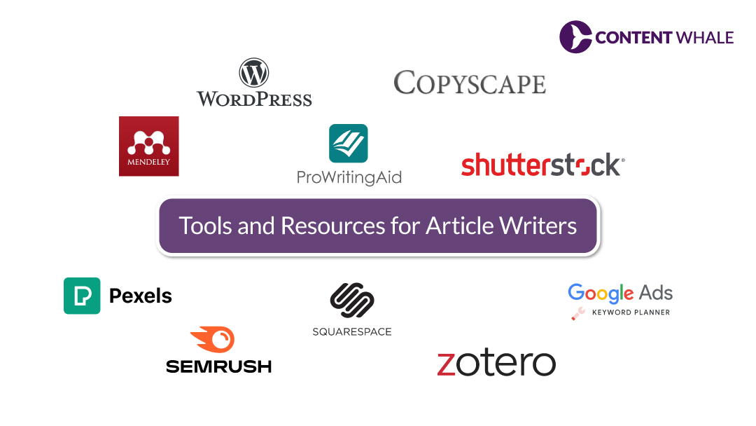
Tools and Resources for Article Writers

Creative with randomly scattered logos of some of the tools mentioned in the below content
1. Grammar and Plagiarism Checkers
Essential for maintaining credibility and professionalism, tools like Grammarly, ProWritingAid, and Copyscape ensure your article writing is both polished and original. They are indispensable for anyone serious about their writing, especially those looking to write articles for money.
2. Citation Management Tools
For those involved in academic or research-based article writing, organizing your sources and simplifying referencing is made easier with tools like Mendeley and Zotero. These tools are particularly useful when adhering to specific article writing formats and when extensive referencing is required.
3. Stock Photo and Video Libraries
Visuals significantly enhance the appeal of your articles. Libraries like Pexels and Shutterstock provide high-quality images and videos that complement your content, which can be crucial when you write an article that needs to engage visually.
4. Keyword Research Tools
To write an article that reaches the intended audience, tools like SEMrush, Answer Socrates, and Google Keyword Planner are invaluable. They help optimize your articles for search engines, aligning your content with what your audience is searching for, which is especially beneficial if you are paid to write articles. If you wish to learn more about which Keyword Research tool to choose, see this keyword research tool guide.
5. Content Management Systems
Platforms like WordPress and Squarespace offer user-friendly interfaces that simplify the publication and management of your articles. These systems are key for those who write articles for money, making it easier to distribute and manage content effectively.
This toolkit not only supports article writing but also enhances your ability to produce and manage content that meets professional standards and audience expectations. Whether you’re exploring long-form writing or seeking article writing examples, these tools can help elevate the quality and impact of your work.
Getting Paid to Write Articles: Exploring Opportunities

Stock image with Upwork or Fiverr as theme
1. Freelance Marketplaces
Platforms like Upwork and Fiverr are excellent starting points for those new to article writing. They offer numerous opportunities to write articles for money, connecting freelance writers with clients who require article-writing services.
2. Content Writing Agencies
Joining a content writing agency can provide more consistent work and a chance to tackle a variety of writing projects. This can be a great way to gain experience if you’re looking to get paid to write articles and refine your skills in different article-writing formats.
3. Direct Outreach
Taking a proactive approach by pitching your article-writing ideas directly to websites, blogs, or publications, can lead to valuable publishing opportunities. This method helps establish professional connections and is a critical step for those who wish to write articles for money.
4. Building a Portfolio and Brand
Developing a strong portfolio that showcases your article writing examples and areas of expertise is crucial in attracting potential clients. It serves as a practical demonstration of what article writing is, with example, helping you build a recognizable professional brand.
5. Negotiating Rates
Understanding the market rate for article writing and learning to negotiate effectively is essential for ensuring that you are compensated fairly for your efforts. This is especially important for freelancers who are paid to write articles, as it impacts their financial stability and recognition of their professional value.
These avenues not only provide opportunities to write an article but also help in mastering what is long-form writing and other styles, enhancing both your skill set and your professional marketability.
Advanced Article Writing Techniques

1. SEO Optimization
Understanding SEO basics is crucial for enhancing your article writing visibility online. Incorporate targeted keywords, craft engaging meta descriptions, and establish internal links to boost your search engine rankings. These techniques are essential for anyone looking to write articles for money.
2. Incorporating Data and Statistics
Using up-to-date, relevant statistics not only supports your arguments but also adds credibility to your article writing. This approach is especially valuable in what is long-form writing, where depth and authority are key to engaging an informed audience.
3. Storytelling Techniques
Engage your readers on a deeper emotional level with storytelling. This technique can make your articles more memorable and impactful, vital for those who write an article that aims to leave a lasting impression.
4. Building Internal Links
Internal links keep readers on your site longer and help improve your SEO. Linking to other articles or sections of your site enhances user experience and boosts engagement, which is critical for those who are paid to write articles.
5. Staying Up-to-Date with Industry Trends
The digital content field is continually evolving. Staying current with the latest trends in content marketing and article writing is crucial to keep your skills sharp and your content relevant. This knowledge is vital for anyone involved in article writing to maintain a competitive edge.

Mastering article writing equips you with a high-leverage communication skill that drives visibility, authority, and opportunity. When you understand structure, audience intent, SEO fundamentals, and clarity of expression, you move from simply writing content to producing strategic assets that inform, persuade, and perform.
Here are some advanced tips to elevate your article writing:
- Adopt a Structured Format
- Incorporate Visuals
- Engage with Experts
- Focus on SEO Best Practices
- Enhance Readability
- Internal Linking
If you’re a business looking to scale traffic, build authority, and convert readers into customers, partnering with experts can accelerate results. At Content Whale, we craft SEO-driven, high-impact articles tailored to your industry and growth goals. Let our team transform your content into a measurable growth engine, reach out today and take the next step toward stronger digital visibility.
FAQs

What is the difference between article writing and blogging?
Article writing involves creating structured, focused content that covers specific topics comprehensively. This contrasts with blogging, which allows for a more personal touch and often includes ongoing updates and a broader scope for discussion.
How long should an article be?
The length of an article should match the complexity of the topic and the depth of coverage required. What is long-form writing? It refers to articles that are detailed and extensive, often exceeding 1,200 words, and provide thorough insights into the subject matter.
Can I write an article without being an expert?
Yes, with thorough research and a clear writing style, you can produce authoritative and informative articles even if you are not a subject matter expert. This approach is essential for those looking to write articles for money without prior expertise in the field.
Where can I find free grammar and plagiarism-checking tools?
Tools like Grammarly offer free versions that provide basic grammar and plagiarism checks. These are valuable resources for ensuring the quality and originality of your content, especially when you are paid to write articles.
How much can I earn by writing articles?
Earnings from article writing vary widely. Factors such as experience, niche, and the platform you write for play a significant role. Freelance writers can earn from a few cents to over a dollar per word, depending on their negotiation skills and established expertise.


