SEO, or search engine optimization, is the process of improving your website and content to rank higher on search engines like Google, and attract more organic traffic, leads, and sales. SEO is one of the most effective and efficient ways to grow your online business, and achieve your goals and objectives. Here’s why:
- According to a recent report by BrightEdge, 68% of online experiences begin with a search engine.
- Backlinko says the #1 result in Google gets approximately 32% of all clicks.
- A recent survey by Search Engine Journal shows that 49% of marketers report that organic search has the best ROI of any marketing channel.
- New research from Visenze finds that 62% of Gen-Z and millennial consumers want visual search capabilities more than any other new technology.
- Ahrefs reports that 96.55% of all pages get zero traffic from Google.
There are still millions of statistics that suggest how important SEO is for your business. However, SEO is not a one-time thing. Instead, it is an ongoing process that requires constant adaptation and innovation.
SEO best practices change over time as search engines update their algorithms and user behaviour evolves. Therefore, staying updated with the latest SEO trends and techniques is vital so you can implement them on your website at the right time.
In this blog post, we will share with you the top 10 best SEO practices to follow based on the current and future developments in the SEO industry. These practices will help you optimize your website for the new era of search and achieve higher rankings and better results.
Top 10 Best SEO Practices to Follow in 2026
1. Optimize Your Website for Google Discover
Google Discover is a feature that shows personalized and relevant content to users on their mobile devices based on their interests, preferences, and behaviour.
It is not based on queries but on user signals, such as browsing history, location, device, and time.
Google Discover can be accessed through the Google app, the Google homepage, On Android devices when you swipe right from homescreen, or the Chrome browser on Android devices.
Google Discover is a great opportunity for website owners to reach new and existing audiences, and increase their traffic and engagement.
However, to appear on Google Discover, you need to optimize your website for this feature, and follow some best practices, such as:
- Create high-quality, original, and engaging content that matches the user’s interests and intent.
- Use clear and catchy headlines, images, and videos that capture the user’s attention and curiosity.
- Use structured data and meta tags to provide more information and context to Google about your content.
- Update your content regularly and keep it fresh and relevant.
- Follow Google’s content policies and guidelines, and avoid spammy or misleading content.
2. Focus on the Core Web Vitals
Core Web Vitals are a set of metrics that measure the user experience and performance of a web page, such as loading speed, interactivity, and visual stability.
Core Web Vitals are part of Google’s Page Experience signals, which also include mobile-friendliness, HTTPS, safe browsing, and intrusive interstitials.
Google has announced that Page Experience signals, including Core Web Vitals, will become a ranking factor in 2026.
Therefore, it is crucial to optimize your website for the Core Web Vitals, and ensure that your pages provide a fast, smooth, and user-friendly experience.
The Core Web Vitals consist of three metrics:
a) Largest contentful paint (LCP)
LCP measures how long it takes for the largest content element on the page to load, such as an image, video, or text block.
LCP reflects how quickly the user can see the main content of the page, and how long they have to wait before they can interact with it.
A good LCP score is 2.5 seconds or less. To improve your LCP score, you can:
- Use a fast and reliable web hosting service.
- Optimize your images and videos, and use responsive formats.
- Minify and compress your CSS, JavaScript, and HTML files.
- Use a content delivery network (CDN) to reduce the distance between your server and your users.
- Preload important resources and defer non-critical ones.
- Implement lazy loading for images and videos that are below the fold.

b) First input delay (FID)
FID measures how long it takes for the browser to respond to the first user interaction on the page, such as clicking a button, entering a text, or opening a menu.
FID reflects how responsive and interactive the page is, and how quickly the user can perform a task or action.
A good FID score is 100 milliseconds or less. To improve your FID score, you can:
- Reduce the amount and size of JavaScript code on your page, and split it into smaller chunks.
- Use a web worker to run JavaScript code in the background, without blocking the main thread.
- Use browser caching to store frequently used resources on the user’s device.
- Prioritize the loading and execution of the most important JavaScript functions.
- Use passive event listeners to improve scrolling performance.
c) Cumulative layout shift (CLS)
CLS measures how much the layout of the page shifts or moves during the loading process, due to changes in the size or position of the content elements, such as images, ads, fonts, or widgets.
CLS reflects how stable and consistent the page is, and how comfortable the user feels while viewing it. A high CLS score can cause frustration and confusion for the user, and lead to accidental clicks or errors.
A good CLS score is 0.1 or less. To improve your CLS score, you can:
- Use fixed dimensions for your images and videos, and avoid using dynamic or responsive sizes.
- Reserve enough space for your ads and embeds, and avoid inserting them above the existing content.
- Use custom fonts that match the size and style of the default fonts, and avoid using font-display:swap.
- Avoid adding new content or elements to the page after the loading process, unless they are triggered by user interaction.
3. Relevant Meta Titles and Descriptions
Meta titles and descriptions are HTML tags that provide a brief summary of the content and purpose of a web page.
Meta titles and descriptions are displayed on the search engine results pages (SERPs), and help users decide whether to click on a page or not. They help search engines understand and index your page, and match it with relevant queries.
Therefore, it is essential to write relevant, clear, and compelling meta titles and descriptions for your web pages, and follow some best practices, such as:
- Use your target keyword and its variations in your meta title and description, and place them as close to the beginning as possible.
- Use modifiers, such as numbers, dates, locations, or adjectives, to make your meta title and description more specific and attractive.
- Use a call to action, such as “learn more”, “read now”, or “buy now”, to encourage users to click on your page.
- Keep your meta title within 50-60 characters, and your meta description within 150-160 characters, to avoid truncation on the SERPs.
- Write a unique and descriptive meta title and description for each page, and avoid duplication or generic content.
- Keywords with similar meanings are often served on the same page. Make sure to check if it’s indeed necessary to add an additional page or to optimize your page’s meta title for multiple similar keywords. This can be easily identified by searching both keywords in Google and observing if the results are the same. If they are, then it’s not necessary to create an additional page, says a leading SEO Agency.
4. Optimize for BERT Algorithm
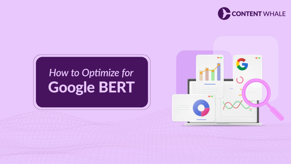
BERT (Bidirectional Encoder Representations from Transformers) is a natural language processing (NLP) algorithm that Google uses to better understand the context and meaning of natural language queries, especially long and complex ones.
It can analyze the words and phrases before and after a given word and determine the most relevant and accurate results for the user.
BERT can also handle nuances, such as synonyms, slang, abbreviations, and intent, that may affect the interpretation of the query.
Optimizing for BERT is not about tricking or manipulating the algorithm but about creating high-quality, relevant, and user-friendly content that matches the user’s intent and expectations. To optimize for BERT, you can:
- Use natural and conversational language, and avoid jargon, fluff, or keyword stuffing.
- Answer the user’s questions directly and clearly, and provide supporting information and evidence.
- Use headings, subheadings, bullet points, and lists to structure and organize your content, and make it easier to read and scan.
- Use synonyms, variations, and related terms to enrich your content, and avoid repetition or ambiguity.
- Use schema markup and structured data to provide more information and context to Google about your content, and increase your chances of appearing in rich results.
5. Content Quality
Content quality is one of the most important factors for SEO, as it can affect your rankings, traffic, and conversions. Content quality is not only about grammar, spelling, or punctuation but also about relevance, value, and originality.
Google’s mission is to provide the best and most useful results for the user, and it rewards websites that create high-quality content that meets the user’s needs and expectations.
To create high-quality content for your website, you need to:
- Conduct thorough keyword research, and target the keywords that your audience is searching for, and that are relevant to your niche and goals.
- Conduct a competitive analysis, and identify the gaps and opportunities in your market, and how you can differentiate yourself from your competitors.
- Write engaging and informative content that answers the user’s questions, solves their problems, and provides them with actionable tips and solutions.
- Use credible sources, data, and statistics to support your claims and arguments, and cite them properly.
- Use multimedia, such as images, videos, infographics, or charts, to enhance your content, and make it more appealing and interactive.
Update your content regularly, and keep it fresh and accurate.
6. Featured Snippets

Featured snippets are a type of rich result that Google displays at the top of the SERPs, and provide a quick and concise answer to the user’s query without the need to click on a page.
Featured snippets can be in the form of paragraphs, lists, tables, or videos and usually include the page’s source URL, title, and image.
Featured snippets can help you increase your visibility, authority, and traffic, as they can attract more attention and clicks from the user.
To optimize your website for featured snippets, you need to:
- Identify the queries and keywords that trigger featured snippets, and that are relevant to your niche and goals.
- Create high-quality and informative content that answers the user’s query directly and clearly, and provides supporting information and evidence. You can use the inverted pyramid method a.k.a funnel model.
- Use headings, subheadings, bullet points, and lists to structure and organize your content, and make it easier to read and scan. You can also use schema markup and structured data to provide more information and context to Google about your content.
- Monitor and measure your performance and results, and see how your content ranks and performs on the SERPs with tools like Google Search Console, Google Analytics, or Rank Tracker.
7. Long Tail Keywords and LSI Keywords
Long tail keywords are keywords that consist of three or more words and are more specific and less competitive than short tail keywords.
For example, “content writing services” is a short tail keyword, while “content writing services for small businesses” is a long tail keyword. Long tail keywords can help you target a more niche and qualified audience, and rank higher on the SERPs.
LSI (Latent Semantic Indexing) keywords are keywords that are semantically related to your main keyword, and share the same context and meaning.
For example, some LSI keywords for “content writing services” are “content marketing”, “copywriting”, “blogging”, and “SEO”. LSI keywords can help you enrich your content and make it more relevant and comprehensive for the user and the search engine.
To optimize your website for long tail keywords and LSI keywords, you need to:
- Find the long tail keywords and LSI keywords that your audience is searching for and are relevant to your niche and goals. There are many tools available for keyword research, such as UberSuggest, Google Keyword Planner, Wordstream, etc.
- Create high-quality and informative content that targets the long tail keywords and LSI keywords and provides value and solutions to the user.
Use the long tail keywords and LSI keywords naturally and strategically in your content, and avoid keyword stuffing or over-optimization. You can use the long tail keywords in your title, headings, introduction, and conclusion, and use the LSI keywords throughout your content, especially in the body paragraphs.
8. High Quality Backlinks
Quality backlinks are backlinks from relevant, reputable, and authoritative websites that have high domain authority, traffic, and engagement.
Backlinks are links from other websites that point to your website and are one of the most important ranking factors for SEO. They can help you increase your authority, credibility, and traffic.
However, not all backlinks are created equal, so you must always focus on quality over quantity.
To optimize your website for quality backlinks, you need to:
- Create high-quality and informative content that attracts and engages your audience, and provides value and solutions to them.
- Promote and distribute your content on various platforms and channels, such as social media, email, forums, and blogs. This will help you maximize your reach-out efforts. You can use tools like Buffer, Mailchimp, or Outreach to automate and streamline your promotion and outreach process.
Build relationships and partnerships with other websites and bloggers in your niche, and offer them guest posts, testimonials, or collaborations. You can also use HARO platforms to create high-quality backlinks without spending money.
9. Optimized Images with Alt-text

Images are an essential part of any website, as they can enhance your content, and make it more appealing and interactive. Images also help you improve your SEO, as they can increase your traffic, engagement, and conversions.
However, to optimize your images for SEO, you need to follow some best practices, such as:
- Use relevant, original, and high-quality images that match your content and brand, and avoid using generic images. You can use tools like Canva, Figma, or Adobe Softwares to create and edit your images.
- Optimize your images for size, format, and resolution, and reduce their file size as much as possible without compromising their quality. You can use tools like TinyPNG, ImageOptim, or Kraken.io to compress and optimize your images.
- Use descriptive and keyword-rich file names and alt-text for your images, and provide more information and context to the user and the search engine about your images. Alt-text is a text that describes the image content.
10. SEO Audits

An SEO audit is a process of analyzing and evaluating your website’s SEO performance and health and identifying and fixing any issues or errors that may affect your rankings, traffic, and conversions.
An SEO audit can help you improve your website’s usability, functionality, and security, and ensure that it meets the latest SEO standards and best practices.
It also helps you discover new opportunities and strategies to optimize your website and achieve your goals and objectives.
To conduct an SEO audit for your website, you need to:
- Use a tool like Google Search Console and Google Analytics to monitor and measure your website’s performance and results, and see how your website ranks and performs on the SERPs. Then, use Google PageSpeed Insights, Lighthouse, or GTmetrix to test and improve your website’s speed and performance.
- Use a tool like Ahrefs, SEMrush, or Moz to analyze and improve your website’s on-page and off-page SEO and see how your website performs on various SEO aspects, such as keywords, content, backlinks, technical SEO, and more. You can also use tools like Screaming Frog, Sitebulb, or SEO Spider to crawl and audit your website, and find and fix any issues or errors, such as broken links, duplicate content, missing tags, and more.
Use a tool like Woorank, SEOptimer, or SEO Site Checkup to generate a comprehensive and detailed SEO report for your website, and get a score and a list of recommendations and suggestions to improve your website’s SEO. You can also use tools like SEO Analyzer, SEO Tester Online, or SEO Audit Tool to perform a quick and easy SEO analysis for your website, and get an overview and a summary of your website’s SEO.
Future of SEO in 2026? 8 Critical SEO Trends to Know

SEO trends and techniques change over time, as search engines update their algorithms and user behaviour evolves. Therefore, it is important to stay updated with the latest SEO trends and techniques and implement them on your website.
We will share with you the future of SEO in 2026, and the 8 critical SEO trends to know and follow. These trends will help you prepare your website for the new era of search, and achieve higher rankings and better results. Let’s dive in!
1. Google Search Generative Experience (SGE)
Google Search Generative Experience (SGE) is a new feature that Google is testing and developing, that aims to provide a more personalized and interactive search experience for the user.
SGE uses artificial intelligence (AI) and machine learning (ML) to generate and display customized and relevant content for the user, based on their query, intent, and context.
SGE is a game-changer for SEO, as it can change the way users search and consume content, and the way websites create and optimize content. To optimize your website for SGE, you need to:
- Create high-quality, original, and engaging content that matches the user’s intent and expectations, and provides value and solutions to them
- Use structured data and schema markup to provide more information and context to Google about your content, and increase your chances of appearing in SGE
- Use multimedia, such as images, videos, audio, or text, to enhance your content, and make it more appealing and interactive for SGE
- Use natural and conversational language, and avoid jargon, fluff, or keyword stuffing, to make your content more compatible and adaptable for SGE
2. Zero-Click Searches

Zero-click searches are searches that provide the user with the answer or information they are looking for, without the need to click on a page or website.
Zero-click searches are usually displayed on the SERPs, in the form of featured snippets, knowledge panels, local packs, or other rich results.
However, zero-click searches are also an opportunity for SEO, as they can increase your visibility, authority, and conversions if you can optimize your website for them. To optimize your website for zero-click searches, you need to:
- Identify the queries and keywords that trigger zero-click searches, and that are relevant to your niche and goals.
- Create high-quality and informative content that answers the user’s query directly in a concise manner.
Use structured data and schema markup to provide more information and context to Google about your content, and increase your chances of appearing in zero-click searches. Tools like Schema.org or JSON-LD Generator to create and implement structured data on your website.
3. Answer Engine Optimization (AEO)
Answer Engine Optimization (AEO) refers to optimizing your website and content for answer engines, such as Google Assistant, Siri, Alexa, or Cortana.
Answer engines are voice-based or text-based platforms that provide users with direct and concise answers to their queries, without the need to browse through multiple websites or pages.
Answer engines are becoming more popular and prevalent, especially with the rise of mobile devices, smart speakers, and wearable gadgets.
However, AEO is also different and challenging, as it requires a different approach and strategy than traditional SEO. To optimize your website for AEO, you need to:
- Use natural and conversational language, and avoid jargon, fluff, or keyword stuffing. You can use tools like AnswerThePublic, AlsoAsked, or QuestionDB to find the most common and relevant questions and topics that your audience is asking and create content around them.
- Use schema markup and structured data to provide more information and context about your content to the answer engines and increase your chances of appearing in AEO.
Use voice search optimization techniques, such as using long tail keywords, optimizing for local search, using FAQ pages, and creating short and simple sentences. You can use tools like Google’s Voice Search Quality Rater Guidelines, Google My Business, or Voice Search Rank Checker to optimize and measure your voice search performance.
4. Topical Authority

Topical authority measures how well your website and content cover a specific topic, niche, or domain and how trustworthy and reliable you are as a source of information and solutions.
Topical authority is important for SEO, as it can help you rank higher on the SERPs, resulting in more organic traffic, leads, and sales.
Google’s algorithms, such as BERT, RankBrain, and E-A-T, use topical authority as a ranking factor and reward websites that provide comprehensive and in-depth content that meets the user’s needs and expectations.
To build and improve your topical authority, you need to:
- Conduct thorough keyword research and find the main and related keywords.
- Create high-quality and informative content that covers the main and related keywords.
Use content clusters and pillar pages to structure and organize your content and create a logical and coherent hierarchy of topics and subtopics. (Content clusters are groups of related content that target a specific subtopic or keyword and link back to a pillar page. A pillar page is a comprehensive and authoritative content that covers the main topic or keyword and links to the content clusters.)
5. Video SEO
Video SEO is the process of optimizing your videos and video content for search engines, and increasing their visibility, relevance, and performance on the SERPs.
According to Optinmonster, 87% of video marketers say that video has increased traffic to their website, and 87% say that video has directly helped increase sales.
To optimize your videos and video content for SEO, you need to:
- Create high-quality, original, and engaging videos that match your content and brand and avoid using stock or generic videos.
- Optimize your videos for size, format, and resolution, and reduce their file size as much as possible without compromising their quality.
- Use descriptive and keyword-rich titles, descriptions, and tags for your videos, and provide more information and context to the user and the search engine about your videos. You can use tools like TubeBuddy, VidIQ, or Morningfame to optimize and improve your video titles, descriptions, and tags.
- Use captions, transcripts, and subtitles for your videos, and provide more information and accessibility to the user and the search engine about your videos.
6. Search Engine Ranking Factors in 2026

Search engine ranking factors are the criteria and signals that search engines use to evaluate and rank websites and web pages on the SERPs.
Search engine ranking factors change over time as search engines update their algorithms and user behaviour evolves.
Therefore, it is important to stay updated with the latest search engine ranking factors and implement them on your website.
According to a recent study by Backlinko, the most important search engine ranking factors in 2026 are:
- Domain Authority: Domain authority is a measure of how trustworthy and reputable your website is, based on the quality and quantity of your backlinks. You must avoid spammy links and create genuine high-authority backlinks. Use Featured.com or HARO to create backlinks for free.
- Content Quality: Content quality is a measure of how relevant, valuable, and original your content is, and how well it meets the user’s needs and expectations. Hire our SEO content writing services, if you are facing issues creating quality content.
- Mobile-Friendliness: Mobile-friendliness is a measure of how well your website and content perform on mobile devices, such as smartphones and tablets. You can use tools like Google’s Mobile-Friendly Test, Google PageSpeed Insights, or Lighthouse Chrome Extension to test and improve your mobile-friendliness.
User Experience: User experience is a measure of how easy, enjoyable, and satisfying it is for the user to interact with your website and content. It can severely affect your rankings, traffic, and conversions. Use Hotjar or Google Analytics to track issues and improve UX.
7. Updating Your Existing Content
Updating your existing content is a process of revising and improving your old or outdated content, and making it more relevant and effective for the current and future situation.
Updating your existing content can also help you improve your content quality, user experience, and topical authority, and ensure that your content meets the latest SEO standards and best practices.
To update your existing content, you need to:
- Use a tool like Google Search Console, Google Analytics, or Ahrefs to identify and prioritize your existing content that needs updating, based on its performance and results.
- Revise and improve your existing content, and make it more relevant and effective for the current and future situation.
- Republish and promote your updated content, and make it more visible and accessible to your audience and the search engine.
8. Approaching User Search Intent
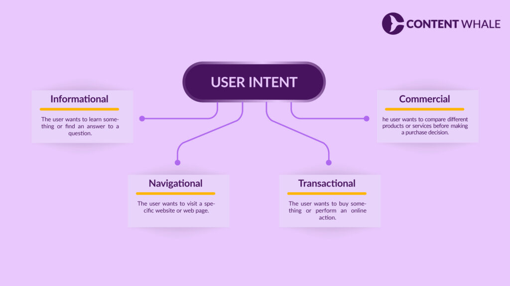
User search intent is the goal or purpose behind a user’s search query and what they expect to find or achieve from the search.
User search intent can be classified into four main types: informational, navigational, transactional, and commercial.
Approaching user search intent is important for SEO, as it can help you create and optimize content that matches the user’s needs and expectations and provides value and solutions to them.
Approaching user search intent can also help you increase your rankings, traffic, and conversions, as you can attract and retain more qualified and relevant users. To approach user search intent, you need to:
- After thorough keyword research, search each keyword to check the user intent and what kind of content is ranking on it.
- Create high-quality and informative content that targets the keywords and their search intent.
- Use schema markup and structured data to provide more information and context to Google about your content.
My Final Thoughts

SEO is not a static or stagnant field, but a dynamic and evolving one. SEO trends and techniques change over time as search engines update their algorithms and user behaviour evolves.
Therefore, it is important to stay updated with the latest SEO trends and techniques and implement them on your website.
In this blog post, we have shared with you the top 10 best SEO practices to follow in 2026, based on the current and future developments in the SEO industry.
We have also shared with you the future of SEO in 2026, and some critical SEO trends to know and follow.
These practices and trends will help you optimize your website for the new era of search, and achieve higher rankings and better results.
We hope you found this blog post useful and informative, and that you learned something new and valuable. Feel free to reach out to us. And if you have any content writing requirements, you can contact us without any hesitation.
As a leading and confident content writing company with a proven SEO record, we ensure your business will grow significantly and indefinitely through our SEO content writing services.
FAQs
Q. What are the top 5 SEO strategies?
The top 5 SEO strategies are:
- Keyword research
- Content creation
- Content optimization
- Link building
- Technical SEO
Q. What are the 3 Cs of SEO?
The 3 Cs of SEO are:
- Content: Content is the king of SEO, as it is the main factor that determines your rankings, traffic, and conversions.
- Code: Code is the foundation of SEO, as it is the main factor that determines your website’s performance, functionality, and security.
- Credibility: Credibility is the goal of SEO, as it is the main factor that determines your website’s authority, reputation, and trust.
Q. Will SEO exist in five years?
Yes, SEO will definitely exist in five years, as it is one of the most effective and efficient ways to reach and engage your target audience and achieve your goals and objectives.
However, SEO will not be the same as it is today, as it will evolve and adapt to the new developments and changes in the search industry, such as new algorithms, features, platforms, and user behaviour. Therefore, you need to stay updated with the latest SEO trends and techniques and implement them on your website.
Q. Will AI kill SEO?
No, AI will not kill SEO but rather enhance and improve it. AI is a powerful and innovative technology that can help you optimize your website and content for the user and the search engine, and achieve higher rankings and better results.
AI can help you with various aspects of SEO, such as keyword research, content creation, content optimization, link building, technical SEO, and more. AI can also help you with new and emerging features and platforms, such as Google Search Generative Experience, voice search, and answer engines.
However, AI will not replace human creativity, intuition, and emotion, which are essential for creating and optimizing high-quality and engaging content that matches the user’s intent and expectations and provides value and solutions to them.
Q. Is SEO still worth it in 2026?
SEO is still worth it in 2026, as it is one of the most cost-effective and long-term ways to grow your online business and achieve your goals and objectives.
It can help you increase your visibility, authority, and traffic, and attract more qualified and relevant users, who are more likely to convert and become loyal customers.
SEO can also help you improve your user experience, content quality, and topical authority and ensure that your website and content meet the latest SEO standards and best practices.
However, SEO is not a quick or easy process, but a complex and challenging one, that requires professional expertise and guidance. Therefore, if you don’t know how to do it, hire a reliable and reputable SEO service provider.
Q. What are the 3 most important factors of SEO?
The 3 most important SEO factors are content, backlinks, and technical SEO.
Q. What are the SEO trends for 2026?
The SEO trends for 2026 are:
- Google Search Generative Experience (SGE)
- Zero-click Searches
- Answer Engine Optimization (AEO)
- Topical Authority
- Video SEO
- And more…
Q. What Is an SEO Strategy?
An SEO strategy is a plan to create, optimize, and promote content to improve its visibility in search engine results, attracting more organic traffic to a website.
Some of the steps to create an effective SEO strategy are:
- Create a List of Keywords
- Analyze Google’s First Page
- Create Something Different or Better
- Add a Hook
- Optimize for On-Page Seo
- Optimize for Search Intent
- Focus on Content Design
- Build Links to your Page
- Improve and Update your Content