Mobile-first indexing is a term that has been making waves in the SEO world for the past few years, and for a good reason. As of 2019, Google officially switched to mobile-first indexing for all new websites, signaling a significant shift in how websites are ranked on search engines. But what exactly does mobile-first indexing mean, and why is it so crucial for your website’s SEO?
In simple terms, mobile-first indexing means that Google predominantly uses the mobile version of a website’s content for indexing and ranking. If your website isn’t optimized for mobile devices, you could be missing out on a significant chunk of potential traffic and better search engine rankings.
The digital world has been increasingly shifting towards mobile. More users now access the internet through their smartphones and tablets than through traditional desktop computers. This shift in user behavior has forced search engines like Google to prioritize mobile-friendly websites. Websites that fail to adapt to this trend risk falling behind in the search engine rankings, which can have a direct impact on visibility and traffic.
This blog will dive into the impact of mobile-first indexing on SEO and provide you with actionable tips on mobile optimization to help enhance your search engine ranking and visibility. Whether you’re new to the concept or looking to fine-tune your existing strategies, this guide will equip you with the knowledge to stay ahead in the ever-competitive world of SEO.
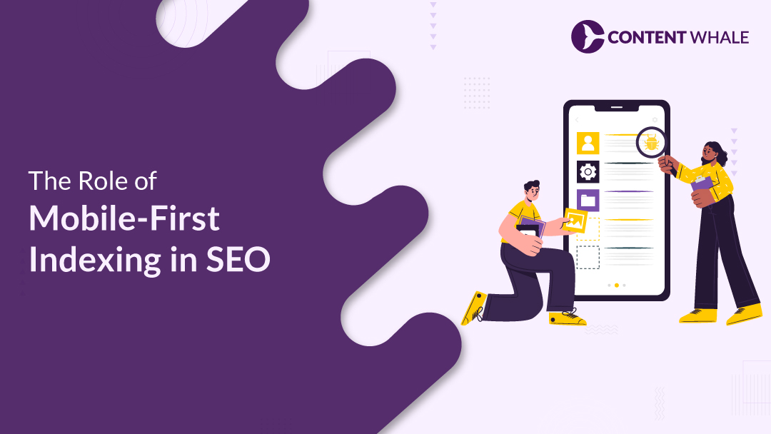
What is Mobile-First Indexing?
Mobile-first indexing is a critical shift in the way search engines like Google index and rank websites. Traditionally, Google’s indexing process focused on the desktop version of a website, with the mobile version being secondary. However, with the growing dominance of mobile internet usage, Google has transitioned to a mobile-first indexing approach. This means that Google’s algorithms now primarily use the mobile version of a site to determine its ranking and indexing in search results.
The concept of mobile-first indexing is straightforward: if your website is not optimized for mobile devices, it could negatively impact your SEO performance. This shift aligns with user behavior trends, where mobile devices account for over 50% of global internet traffic. Websites that are mobile-friendly are more likely to rank higher in search results, making mobile optimization an essential aspect of any SEO strategy.
Google’s approach to mobile-first indexing underscores the importance of providing a seamless mobile experience. Websites that are not mobile-optimized may experience a drop in search rankings, reduced visibility, and ultimately, a loss of traffic. Therefore, understanding and implementing mobile-first indexing is crucial for website owners who want to maintain and improve their search engine rankings.
The importance of mobile optimization cannot be overstated in today’s digital landscape. Responsive design, fast loading times, and mobile-friendly content are no longer optional—they are necessary for success. As Google continues to prioritize mobile-first indexing, businesses must adapt their SEO strategies to focus on mobile performance to stay competitive.
1. Improved User Experience
Mobile-first indexing has shifted the focus to enhancing user experience, especially for mobile users. Given that a large portion of web traffic now comes from mobile devices, it’s crucial to ensure your website is optimized for mobile performance.
Responsive Design
This design approach ensures that your website automatically adapts to various screen sizes, providing a consistent and user-friendly experience across all devices. By making your site responsive, you enhance readability and navigation, which makes it easier for users to interact with your site on smartphones, tablets, or desktops.
Site Speed Optimization
Site speed plays a critical role in user experience and SEO. Research shows that 53% of users will abandon a site if it takes longer than three seconds to load. Optimizing site speed involves compressing images, reducing server response times, and leveraging browser caching to ensure your site loads quickly on mobile devices. Faster loading times not only improve user satisfaction but also positively impact your search engine rankings.
Engagement and Conversion Rates
A well-optimized mobile site can significantly boost user engagement and conversion rates. When users have a positive experience—characterized by easy navigation, fast loading times, and accessible content—they are more likely to stay longer, interact with your site, and convert into customers. This emphasis on user experience is essential in the mobile-first indexing era.
Focusing on these aspects of mobile optimization ensures that your website not only aligns with Google’s mobile-first indexing but also provides a better overall experience for your users. This, in turn, can lead to improved SEO performance and better business outcomes.
2. Changes in Search Rankings

Mobile-first indexing has brought notable changes in how search engines rank websites, placing a significant emphasis on mobile optimization. With this shift, it’s essential to understand the key factors that impact your site’s search rankings.
Impact on Search Rankings
Google’s mobile-first indexing means that the mobile version of your website is primarily used for indexing and ranking. If your site isn’t optimized for mobile devices, it may rank lower in search results, even if your desktop site is well-optimized. This change underscores the importance of having a mobile-friendly site to maintain or improve your search engine visibility.
Optimizing Mobile Content
Ensuring that your content is optimized for mobile is crucial under mobile-first indexing. This involves using a responsive design that adapts to different screen sizes, making sure images and text are accessible and legible on mobile devices. It’s also important to maintain consistency between your mobile and desktop content to avoid any discrepancies that could negatively impact your rankings.
Mobile-Friendly Best Practices
To boost your search rankings, focus on improving your site’s speed, usability, and overall mobile-friendliness. Techniques such as compressing images, utilizing accelerated mobile pages (AMP), and avoiding intrusive pop-ups can greatly enhance user experience. A better user experience typically leads to higher engagement, which is rewarded by search engines with improved rankings.
Importance of Structured Data
Implementing structured data (Schema) on your mobile site can help search engines better understand your content, which can lead to richer search results. This is especially important in a mobile-first environment where detailed and accurate information enhances your site’s visibility.
By focusing on these key areas, you can align your website with the requirements of mobile-first indexing, improving your chances of ranking well on search engines and driving more organic traffic to your site.
3. Importance of Responsive Design

Responsive design is crucial for mobile-first indexing SEO, ensuring your website performs well across all devices. It allows your website to adapt automatically to different screen sizes, providing an optimal user experience whether accessed from a desktop, tablet, or smartphone.
Key Benefits of Responsive Design
- Improved Usability: Responsive web design makes it easier for users to navigate and interact with your website, regardless of the device they are using. This leads to longer time spent on your site, lower bounce rates, and higher engagement, all of which are positive signals for search engine rankings.
- SEO Performance: Google recommends responsive design as the preferred approach for mobile-first indexing. A responsive site ensures that all your content is accessible and properly indexed, helping to maintain or improve your search rankings. Google favors mobile-friendly websites, which makes responsive design essential for any SEO strategy.
- Consistent User Experience: Responsive design provides a consistent user experience across all devices. Your site should look and function similarly, whether accessed on a smartphone or a desktop. Consistency in experience not only satisfies users but also ensures that all your content is easily shareable and linkable, supporting your SEO efforts.
Best Practices for Implementing Responsive Design
- Use Fluid Grids: A fluid grid layout uses relative units like percentages rather than fixed units like pixels, allowing elements to resize proportionally according to the screen size. This ensures your site adapts smoothly across devices.
- Optimize Images and Media: Ensure images and videos are responsive by setting maximum widths in your CSS and using media queries to adapt content for different screens. Compressing images helps maintain fast loading times, which is critical for mobile users.
- Media Queries: Implement media queries in your CSS to adjust your site’s layout and design elements at different screen sizes. This allows customization of how content is displayed on various devices, ensuring readability and usability.
- Test Across Devices: Regularly test your website across different devices and screen sizes to ensure it is fully responsive and functional. Tools like Google’s Mobile-Friendly Test can help identify areas for improvement.
By adhering to these practices, you can enhance your site’s mobile performance, align with mobile-first indexing requirements, and ultimately boost your search engine rankings and user satisfaction.
4. Site Speed and Performance

Site speed and performance play a crucial role in mobile-first indexing and overall SEO success. With Google prioritizing mobile-first indexing, optimizing your site’s speed for mobile devices is more important than ever.
Importance of Site Speed in Mobile-First Indexing
- Impact on User Experience: Slow-loading pages can frustrate users, leading to higher bounce rates and lower engagement. Google recognizes this, and sites with faster load times are likely to rank higher in search results. Users expect pages to load in less than three seconds, with even faster load times being preferable.
- SEO Benefits: Page speed is a critical ranking factor in mobile-first indexing. A faster site not only improves user satisfaction but also signals to Google that your site is optimized for mobile users, which can positively impact your search engine rankings.
Tips to Improve Site Speed for Mobile Optimization:
- Optimize Images: One of the primary reasons for slow page loads is unoptimized images. Compressing images and using next-gen formats like WebP can significantly reduce file sizes without compromising quality. Properly sizing images and enabling text compression can also improve load times.
- Minimize HTTP Requests: Reducing the number of HTTP requests by combining files like CSS and JavaScript can streamline the loading process. The fewer requests your page has to make, the faster it will load.
- Leverage Browser Caching: Caching allows browsers to store static resources locally, reducing the need to download the same data multiple times. This technique helps in speeding up subsequent visits to your site and improves the overall user experience.
- Use a Content Delivery Network (CDN): A CDN distributes your site’s content across multiple servers globally, ensuring that users receive data from the nearest server, which reduces load times. This is especially beneficial for mobile users who may be accessing your site from various locations.
- Eliminate Render-Blocking Resources: Scripts that block the rendering of your page can delay the display of content. By deferring or asynchronously loading non-essential scripts, you can ensure that the critical content is loaded quickly for users.
- Optimize Server Response Time: Reducing the time it takes for a server to respond to requests can drastically improve page load speeds. Techniques like GZIP compression and investing in robust hosting solutions can help in achieving this.
By implementing these strategies, you can improve your site’s speed and performance, aligning with mobile-first indexing requirements and enhancing your SEO outcomes.
5. The Role of Mobile-Friendly Content
In the era of mobile-first indexing, optimizing your content for mobile devices is essential for improving your website’s SEO performance. With more than half of all internet traffic coming from mobile devices, ensuring that your content is mobile-friendly is no longer optional—it’s a necessity.
Why Mobile-Friendly Content Matters
- Google’s Mobile-First Indexing: Google primarily uses the mobile version of your website’s content to rank pages. This means that if your content isn’t optimized for mobile, it could negatively impact your search rankings, even for desktop users. Mobile-friendly content ensures that your website is considered relevant and accessible, which helps improve your visibility in search engine results.
- User Experience: Mobile users expect a seamless browsing experience. If your content is difficult to read or navigate on a mobile device, users are likely to leave your site quickly, increasing your bounce rate—a negative signal for SEO. Optimizing your content for mobile helps keep users engaged, which can improve your overall SEO performance.
How to Optimize Content for Mobile-First Indexing
- Short Paragraphs and Concise Introductions: Mobile screens are smaller, making long paragraphs appear even longer and harder to read. Keep your paragraphs short, ideally around 2-3 sentences, and get to your main points quickly. This structure makes your content more scannable and keeps users engaged.
- Use Responsive Design: Ensure that your website’s design is responsive, meaning it adapts to different screen sizes and orientations. This not only makes your site more visually appealing but also ensures that all your content is easily accessible on any device.
- Optimize Images and Media: Large images and media files can slow down your site’s load times on mobile devices. Use compressed images and next-gen formats like WebP to reduce file sizes without sacrificing quality. This helps your site load faster, improving both user experience and SEO.
- Enhance Navigation: Simplify your site’s navigation for mobile users. Use easy-to-tap buttons and consider implementing a hamburger menu to keep your navigation organized and accessible. This makes it easier for users to find what they’re looking for without frustration.
- Avoid Intrusive Pop-Ups: Pop-ups that cover the main content can be particularly disruptive on mobile devices. Google penalizes sites with intrusive pop-ups, so use them sparingly and ensure they are easy to close.
By following these best practices, you can create mobile-friendly content that aligns with mobile-first indexing, improves user experience, and boosts your SEO rankings.
Conclusion

The shift to mobile-first indexing is a pivotal moment in the evolution of SEO, reflecting the growing dominance of mobile devices in internet usage. As businesses continue to adapt to this change, the importance of mobile optimization becomes increasingly clear.
Optimizing for mobile-first indexing isn’t just about keeping up with Google’s algorithm changes—it’s about meeting user expectations and ensuring your website remains competitive. A mobile-friendly site with fast loading times, responsive design, and well-structured content can significantly boost your search engine rankings and improve user engagement.
By prioritizing mobile-first SEO strategies, such as optimizing page speed, ensuring content consistency across devices, and focusing on user experience, businesses can secure a competitive edge in the digital marketplace. This approach not only enhances visibility and search rankings but also fosters a better user experience, leading to higher customer satisfaction and increased conversions.
As mobile internet usage continues to grow, embracing mobile-first indexing is essential for businesses aiming to thrive in the mobile-centric era. It’s a strategy that ensures you stay ahead of the curve, providing a seamless experience for users and maintaining strong SEO performance in an increasingly competitive digital landscape.
FAQs
1. What is mobile-first indexing, and why does it matter for SEO?
Mobile-first indexing is a process where Google primarily uses the mobile version of a website for indexing and ranking in search engine results. This shift is crucial because it aligns with the growing trend of users accessing the internet primarily through mobile devices. If your website isn’t optimized for mobile, it could negatively impact your search rankings, even if your desktop version is well-optimized. This makes mobile optimization essential for maintaining visibility in search engine results.
2. How can I optimize my website for mobile-first indexing?
To optimize your website for mobile-first indexing, start by ensuring that your site is fully responsive, meaning it adapts seamlessly to different screen sizes and devices. Improve your page speed by compressing images, minifying code, and leveraging browser caching. Additionally, ensure that the content on your mobile site is consistent with your desktop site, including text, images, and videos. Regularly test your site’s mobile-friendliness using tools like Google’s Mobile-Friendly Test.
3. What are the key benefits of mobile-first indexing for SEO?
Mobile-first indexing benefits SEO by ensuring that websites are optimized for the growing number of mobile users. This optimization leads to better user experiences, faster loading times, and improved search engine rankings. Sites that are mobile-friendly are more likely to rank higher, which can result in increased traffic and better visibility online. Additionally, mobile optimization can enhance local SEO, helping businesses attract more local customers.
4. How does mobile-first indexing affect search engine rankings?
Mobile-first indexing affects search engine rankings by prioritizing mobile-optimized content. If your site provides a poor mobile experience—such as slow loading times, difficult navigation, or incomplete content—it may rank lower in search results. Conversely, a well-optimized mobile site can improve your rankings, as Google favors sites that offer a seamless mobile experience.
5. What tools can help improve mobile optimization for SEO?
Several tools can assist in improving mobile optimization for SEO. Google’s PageSpeed Insights helps identify and fix issues affecting page load speed on mobile devices. The Mobile-Friendly Test tool evaluates how easily a visitor can use your page on a mobile device and provides suggestions for improvement. Additionally, using structured data tools like Google’s Structured Data Testing Tool ensures that your mobile site’s metadata is correctly implemented and optimized for search engines.